When you’re a software-as-a-service company, your website is your shop window.
You can have the best product and marketing strategy in the world, but you’ll always struggle to convert visitors to customers if your website doesn’t entice users and sell your software.
Whether you’re building a SaaS website for the first time or redesigning your existing site in 2022, it’s much easier to get started when you have a checklist to follow.
Here are the four things that a high-converting SaaS website should have.
1. A Clear, Upfront Value Proposition
Don’t bury the lede. Let your customers know immediately, at the very top of the page, what your product can do for them.
A good value proposition takes time to craft. Finding the right tone and the right words to express your value is some of the hardest work your marketing team does. So, don’t rush this part of the process.
HubSpot’s Basha Coleman has some great tips to help guide this process, plus examples for inspiration. This will help you outline what it is you have to say.
Now, let’s talk about how you say it, which is every bit as important.
In a piece for Newsweek, brand strategist Kisha Renee Ward talks about what a brand can do to humanize its voice, particularly for audiences that have experienced trauma, hardships or any other difficulties. Ward’s last two pieces of advice — be authentic and be empathic — especially resonate.
“People are spending more time online interacting with brands while simultaneously being more sensitive to the world’s events,” she writes. “Your brand will need to operate with more compassion and sensitivity than may have been previously necessary. It may require more work, but just like your human personality is flexible enough to adjust, your brand personality should be capable of the same.”
Keep that advice in mind as you craft your value proposition. Your customers don’t have the time or patience for a “Hey guys!”-finger-guns-blazing sales pitch. They have bosses asking them to find a replacement for the software their company has outgrown, which has itself added more work to everyone’s plates.
That’s the kind of sensitivity that will work here.
Be upfront, be honest, be authentic and be mindful that your customers have work to get back to. Give them what they need so they can make quick decisions about whether your product is a good fit for their needs.
2. Customer Stories
Whenever a customer recognizes a solution to their problems in your product, you’re in business. Counterintuitively, perhaps, this is the moment to cede the stage to someone else: Your existing customers.
Customer stories are one of the most effective elements of a high-converting site.
Building trust with customer stories and testimonials is a core part of the StoryBrand Framework. Adopting this framework is essential if you want your homepage to entice visitors and encourage them to take action, says user experience consultant Anak Garcia.
“It is imperative to position the business as the guide and the solution to the customer’s problem,” Garcia writes. “UX designers who master the art of creating trust will have an easier time convincing people that this particular brand is the right solution to their problems.”
Customer stories shouldn’t be the focus of your SaaS website design, however. Rather than place them front and center, Steven Snell, editor-in-chief at Vandelay Design, advises testimonials be placed below the fold.
“This location makes sense because as a visitor scrolls down your homepage, the content of the page should be working to sell that person on your capabilities and what you can do for them. A positive statement from a customer or client then follows that up and reinforces or proves your point.”
Make sure your customer stories are accompanied by visuals that bring them to life, says Nadia Basil, vice president of marketing at marketing and creative consultancy Manual Labor Studio. Infographics and video can be powerful, but less resource-intensive options like photography and other visuals can be just as effective.
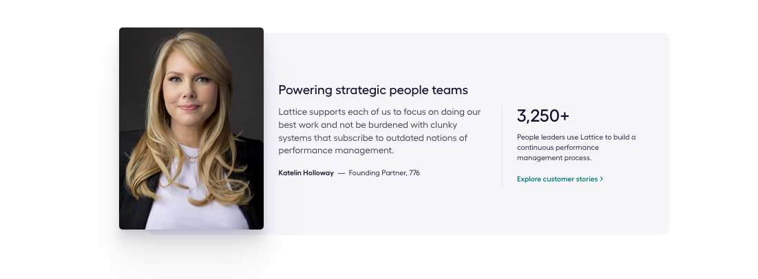
People management platform Lattice makes customer stories a core component of their homepage design. Eye-catching photography means it’s one of the first blocks of content users notice below the fold. A concise testimonial explains exactly how Lattice solves the customers’ problems, followed by a link to more customer success stories:
3. Plenty of Whitespace
If there’s one thing most SaaS websites aren’t, it’s cluttered. Most use whitespace to great effect to create a clear and pleasurable user experience. You should do the same.
Whitespace doesn’t have to be white, though, says the team at SucessiveTech. “When designers talk about whitespace, they actually mean negative space. In other words, the space between screen elements.”
Using whitespace effectively comes with a host of benefits, according to SaaS company Usabilla, now part of the GetFeedback CX platform. It makes your site significantly more user-friendly, particularly when it comes to making your content more readable. It also stops your users from becoming overloaded with information or visual stimuli.
But don’t go overboard with your use of whitespace, warns Rajeesh P.K, the director and creative head at Acodez. “Extra whitespace creates a low information density of the web page. This means that the layout offers less info as opposed to the expectations of the users.”
It can also create problems for mobile users who have to scroll excessively to find the next block of content. The hierarchy of the page also becomes a problem. With too much space between each blog of content, it can be challenging for visitors to follow the flow of your site. In other words, it becomes much less engaging.
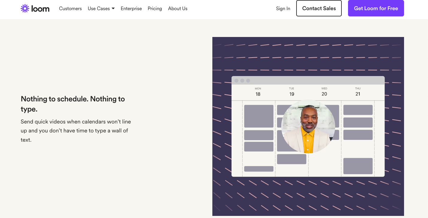
Asynchronous video platform Loom uses whitespace to draw the user’s attention to each of their product’s key features and benefits. The judicious amount of whitespace around each headline and graphic means there’s simply no missing it when you scroll through the site:
4. One-Page Design
On the topic of easy design trends, is there anything easier than building a one-page website? We don’t think so, and the good news is that a one-page SaaS website can be just as effective as their larger, multi-page counterparts.
One of the best things about one-page sites is that designing it is “inevitably much quicker and cheaper than for multiple-page sites,” says digital marketer John Rooney. But it’s also a matter of quality versus quantity. “[Designers] can really focus on delivering a consistent and immersive user experience, helping to boost engagement and hopefully conversion rates too.” Naturally, it’s also easier to maintain a one-page website in the future.
Single-page sites aren’t perfect, however. One issue they suffer from is the lack of broad keyword targeting, says Adam Heitzman, cofounder and managing partner at SEO firm HigherVisibility.
“Single page sites are generally supposed to be designed around one main concept, which limits your ability to rank for a wide variety of keywords,” he writes. “One of the benefits a multi-page site has is that every page on their website is a new opportunity to position (rank) themselves to target an audience specific to that page’s theme. This may end up being the deciding factor for some business owners.”
One solution to this issue is to combine your one-page SaaS site with a blog. A blog doesn’t detract from the focus that a one-page site offers, but it also gives you a chance to showcase your expertise and rank for multiple target keywords.
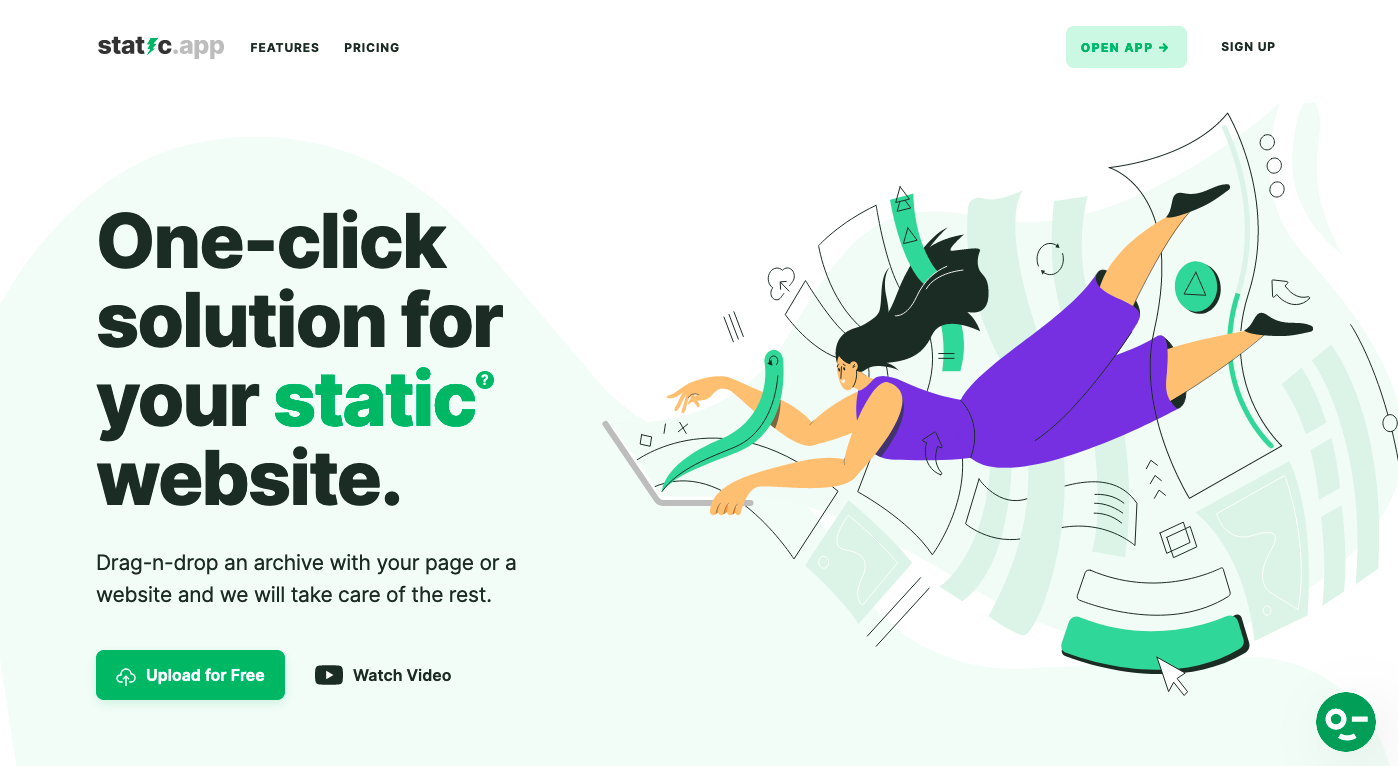
Static page hosting platform static.app offers a great example of what a well-designed, informative one-page website can look like. Everything a potential user needs to know, like features, benefits and pricing, can be found just by scrolling. Anchor links in the menu bar to make navigation even easier:
Designing Your SaaS Site in 2022
There are many ways to build a SaaS website in 2022, but the fundamentals are fairly static. Any website is stronger with customer stories and whitespace, and you don’t have to build out a multi-page site. If you’re strapped for time or just want to focus on quality over quantity, a one-page website can still be extremely effective.
Image: Visual Design

- How to Get the Best Ideas From Your Subject Matter Experts - July 12, 2022
- The SaaS Buyer’s Journey: Discovering New Solutions - June 14, 2022
- 15 High Authority Guest Posting Sites for SaaS Brands - May 31, 2022